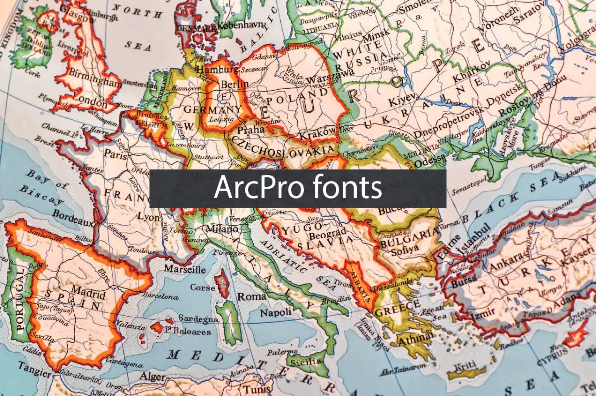
Design and generation of professional maps and related visual schemes are inherent parts of GIS, and the arcpro fonts are an essential tool to leverage these visuals effectively and esthetically. As it relates to any other area of GIS applications involving creation of maps for environmental conservation, construction among others, the font you choose determines the overall quality and appearance of the work to be accomplished.
In this blog, we will explore the processes involved in choosing appropriate fonts within ArcGIS Pro (ArcPro) and efficient tips for applying these arcpro fonts to produce high-quality maps and visuals. Once you finish reading this article, you will have gained enough knowledge to improve GIS projects using ArcPro fonts.
Table of Contents
Why Fonts Matter in GIS
Here are the tips on font selection before diving deeper into why fonts matter in GIS projects. Typefaces are not only letters but also elements of map design that can improve legibility, convey information, and provide an aesthetic appearance. Here’s how fonts impact GIS projects:
1. Legibility and Clarity:
Fonts really matter when it comes to a map; they can either make it clear or confusing. Proper font differentiation is the key here so that the map is not confusing and the information displayed is legible. Sometimes, a bad choice of fonts leads to an overcrowded and unreadable map that doesn’t visualize the spatial data properly.
2. Professionalism:
Correct fonts help to make the final result look more professional when designing a map or visualization. Whether you are writing a report and want to include maps for the client or whether you want to provide your stakeholders with certain data in the form of a map, having a neat and well-designed map might make it easier for it to be in the spotlight.
3. Design Consistency:
The font should be consistent throughout the title, labels, legends, etc., on your map so that they are in harmony. This makes the map very appealing, easier for other people to read, and more attractive to them.
4. Emphasis and Hierarchy:
Proper selection of fonts and font types can help to distinguish certain components of the map, which would otherwise interfere with one another – this is when a clear visual hierarchy comes in handy, and with its help, important elements such as important locations, borders or labels can easily be pointed out.
The following sections provide information about why fonts are important, as well as practical recommendations for applying ArcPro fonts when designing effective maps.
Top Tips for Creating Professional Maps and Visuals with ArcPro Fonts
Choose the Right Font for Your Purpose
The initial and crucial process of font application in the Arcpro fonts environment also involves font choosing properly. Each map or visual may be best done with certain types of fonts, which may differ from other visuals. For example:
- For Titles and Headers: Try to combine brawny, simple and sanitary fonts for titles to make them more distinguishable. It is suggested that many clear typeface names such as Arial, Helvetica, and Franklin Gothic should be used in titles.
- For Labels: Select a font that will show well when the document is zoomed in or out. Non-curved fonts like, for example, arrow or Tale are perfect for labels because they look good even when they are printed in a smaller size.
- For Legends and Annotations: Remember the annotations’ readability and choose the fonts that look balanced, like Times New Roman or Calibri.
Maintain Consistency Across the Map
Where fonts are concerned, GIS design needs to be consistent. In your map or visualization, however, you should not use more than two or three typefaces. However, redesigning one’s map using several font types can spoil the facility’s attractiveness and make it look unprofessional. Use one typeface style to mark the title and labels of figures, and use another typeface style for annotations or subtext.
This refers to fact that the font sizes used should be the same for similar text on map. For instance, make sure to use the same font size for place names, for road names, and for city names as this will only confuse them.
Consider Font Size and Readability
Size can be regarded as one of the most important factors that determine the effectiveness of the ArcPro fonts. Font size would probably be the most influential element that has a direct correlation with the possibility of reading your map. Keep the following guidelines in mind:
- Main titles should be bigger and bigger than other titles, maybe even in a different color. If the map extent is not large, it is possible to use a font size of at least 24 pt or higher.
- Identifying labels for places or cities should be smaller than the titles, but at the same time, the size should be standard enough to enable one to read them from a reasonably decent distance. The figures and labels should be 10-14 pt, usually preferred for these labels.
- It’s possible to have the legends or annotations in fine typesizes (8-10 pt and below) while at the same time the generated images must be expandable without distortion.
- Another thing that is good about ArcGIS Pro is that it enables one to change fonts for different objects, thus one needs to check the legibility at distance in case they wish to maintain professional outlook of the map.
Use Contrast for Emphasis

Contrast also stands out as a key element in map design because it helps to emphasize a component. Using a bright font on a light background, there is a high contrast which makes the optics more visible. On the other hand, dark-Shaped fonts over the light backgrounds have the modern outlook.
Consider the following contrast tips:
- Use light-colored font over a dark background for titles or headings.
- A light-colored background with a very dark font for the fine print, like labels and annotation.
That is why the text remains comprehensible with this antithetical approach while having an appealing appearance. But do not overdo this feature as it makes a map to appear parked with too many contrasts.
Do Not Compartmentalize Text Components
When using fonts in the map what you should ensure you leave adequate space around your text so to avoid crowding. Population causes difficulties in the understanding of the primary material for the reader; moreover, the map will look comparatively crowded.
If your map contains a lot of text, consider:
- Allowing your text a little breathing space by modifying the space between letters and the kerning.
- Informative labels are carefully placed in order to avoid cluttering areas, which will later have to be fully undefined by drawing large empty spaces.
- Numerous options are available in ArcGIS Pro, namely label placement and offset options, to help control the position of labels so that they do not overlap.
Incorporate Font Styles for Visual Hierarchy
Depending on their design, fonts can serve as leading pointers, directing the viewer’s gaze to the most important parts of your map. Structurally, there are basic rules that help you to enhance your map: using different types of fonts – bold, italic, and regular – you can build a hierarchy.
For example:
- Other than the garage sale text color and the Sunday logo design, bold greens are used for major features or other important areas.
- Secondary information or second-level graphics in italics.
- The secondary tier font is just for the notes or additional information.
- It also aids in arranging the map, which you can easily navigate when you go back to develop your content and determine where to put vital information.
Try Your Map At Different Scales
One of the design hurdles maps present is when you are left scratching your head about how you will maintain your fonts’ clarity as the fans zoom in and out. One might look perfect at one level but doesn’t fit at another. To this, I would suggest you test your map on different zoom levels and confirm if the text is readable, appropriate, and manageable.
If you go to the properties of your text, you can set the different scales, and then you can ensure that your map looks professional at any magnification.
Conclusion
Designing professional maps and visualizations using ArcPro fonts considers the choice of font type, size, gaps, and contrast. When it comes to GIS projects, it’s imperative to work on bringing clarity, professionalism, and the quality of layouts to be effective and communicate the intended ideas effectively to the end users. Do not underestimate the power of fonts; well-chosen fonts set your map from the average, cluttered, hard-to-read, and aesthetically unappealing map to a piece of work that conveys data well.
Whether using maps for planning, environmental analyses, or any other GIS project, knowing about ArcPro fonts will assist you in communication your GIS data more effectively.


