Have you ever thought about why some colors are just right for a brand or why some sites make you feel calm and others – energetic? Usually, the secret is in the color psychology – the fascinating science of examining what impact colors have on our feelings, perception, and even our decisions.
No matter whether you are a graphic designer, marketer, business owner or just a passionate visual creator, knowledge about color psychology can definitely make a total difference. There is more than meets the eye within the selection of nice colors; it’s more about selecting colours that resonate with your audience at a deeper emotional level.
This article will focus on what colour psychology actually is, why it is incredibly important in design, and how you should be implementing colour theory so that you can make your projects more powerful and more memorable. Plus, we’ll introduce some fresh colour trends for 2025 and common mistakes to avoid.
Table of Contents
What Is Colour Psychology?
The essence of colour psychology is the impact which the colors have on human feelings and behavior. Colors are not used merely to compliment a design – they communicate. They can instigate trust, excitement, or calmness or desperately urgent feelings off all lips.
Brand examples would include Coca-Cola bold red or Facebook’s soothing blue. These colors aren’t accidental; they are specifically selected to qualify specific feelings and produce an instant recognition.
According to research, people’s purchasing behaviours are up to 85% dependent on colour. That’s a great reason why color psychology holds such importance for anyone who does designs or branding.
What Do Different Colours Mean?
Every colour has its own feeling. Although there can be slight variations using culture and personal experiences, here’s a general outline of what colours usually mean:
- Red: Passion, energy, urgency, excitement. Works well for the achievement of attention or action.
- Orange: Warmth, friendliness, creativity. Great for youthful, energetic brands.
- Yellow: Happiness, optimism, playfulness. Usually used to stand out or alert.
- Green: Growth, health, nature, wealth. Ideal for eco-friendly or finance-related projects.
- Blue: Trust, calm, professionalism. Common to tech, finance, and healthcare.
- Purple: Luxury, creativity, wisdom. Used in beauty and premium brands.
- Black: Sophistication, power, elegance. Popular in fashion and luxury.
- White: Cleanliness, simplicity, purity. Very suitable for minimalist or medical designs.
- Grey: Neutrality, balance, professionalism. Generally used in a background or corporate theme.
Understanding these associations will aid you in choosing the colours that will help tell the story you want.
Why Should You Care About Colour Psychology in Your Designs?
1. It Shapes How People Feel
Your audience’s and their feelings can be subliminally influenced by colors. For example, blue tints can make users safe and relaxed, therefore, the banks and hospitals are attracted by it. On the other hand red can create urgency and as such, it’s nice for sales or time limited offers.
2. It Builds Brand Recognition
Use of the same colour makes your brand instantly memorable. Consider for a moment how you can spot at a distance a McDonald’s because of its icon status of red and yellow. Utilized correctly the colors can increase the brand awareness up to 80%.
3. It Guides Attention and Actions
Colour has an effect on where it looks and where to go next. For example, a bright orange “Buy Now” button in a blue background draws attention and delivers clicks due to contrast and emotional effect.
4. It Creates Balance and Harmony
A successful color palate provides your design with an impression of balance, flows nicely to the eye. Color clash, too much color of anything can baffles or distracts users. Complementary colours are used to keep the viewer’s attention where it is supposed to be.
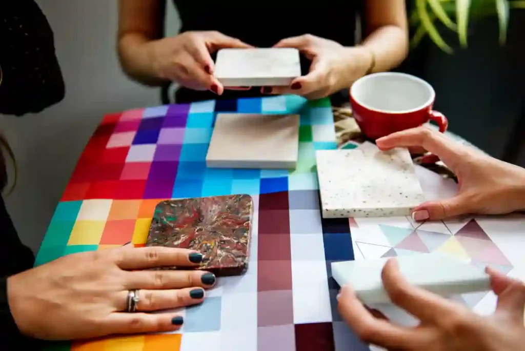
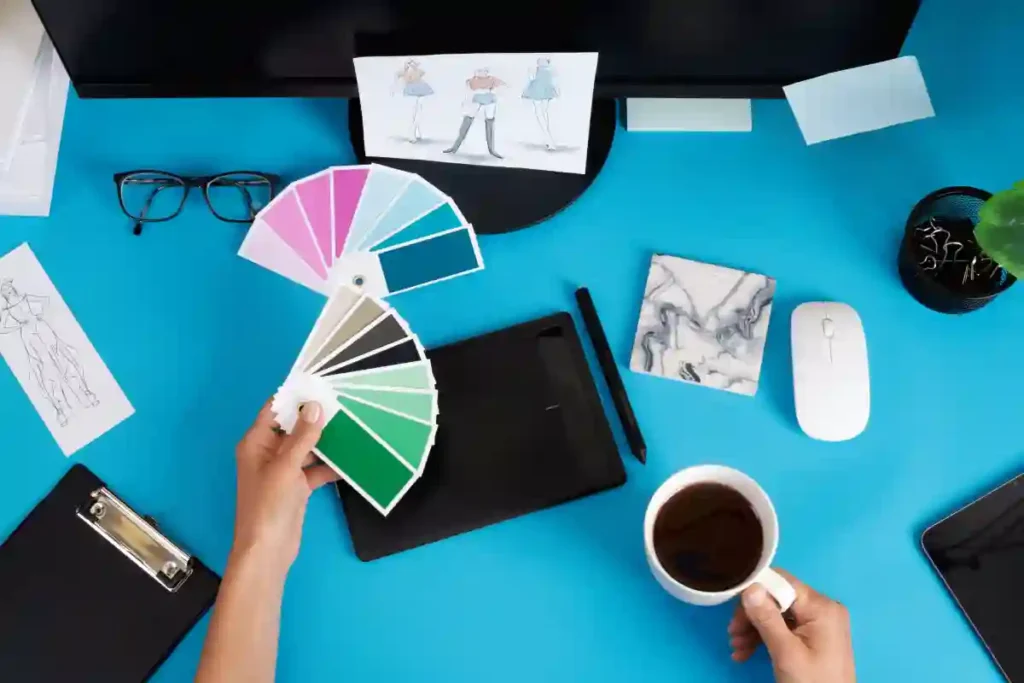
How to Use Colour Psychology in Your Projects
Step 1: Understand Your Goals and Audience
Before choosing colours, ask yourself: How will my emotion or message be sent? Who am I designing for? The rest of the audience reacts differently to colors depending on their age, culture and tastes.
Step 2: Select a Main Colour to Match Your Message.
Select the dominant colour which will correspond to your brand’s personality and objectives. Want to appear trustworthy? Blue is your friend. Need to energise your audience? Red or orange may do a better job.
Step 3: Build a Balanced Colour Palette
- Harmony can be created by using the colour wheel
- Opposite on the wheel, complementary colours create a bright contrast.
- Colours akin to each other (next to each other) provide a smooth, cohesive look.
- Monochromatic palettes involve the use of colours of just one colour, and such palettes give a calming effect.
- Your palette should be modest in flavours – typically 2-3 primary ones and 1-2 accents – to avoid visual chaos.
Step 4: Consider Cultural Differences
Colours have different meanings in different places. For instance, white connotes purity in a number of Western civilisations and means mourning in a few Asian nations. Research your audience’s cultural context at all times.
Step 5: Test and Adjust
Don’t randomly guess – experiment your color choices with actual users. Basing on A/B Testing or feedback find what works best in terms of readability, emotional effect and user behaviour.
Colour Trends to Watch in 2025
The trends in design do change, and colour preferences change as well. Here are some colour direction thrills for 2025:
- Earthy Neutrals: Warm browns, terracotta, olive greens, which are connected with nature and with sustainability.
- Bold Jewel Tones: Deep pine purples, emerald greens and sapphire blues, that are luxurious and creative.
- Vibrant Digital Colours: Neon blues, pinks, purples that came from the techniques of all things tech and future.
Pantone’s Color of the Year 2025, Mocha Mousse, is a warm earth tone, elegant but comfortable – ideal for brands that want a down to earth but modern feel.
Common Mistakes to Avoid
- Too Many Colours: Colour oversaturation by using too many hues may confuse users and ruin your message.
- Ignoring Contrast: Bad contrast makes it difficult for users to read text and frustrates users.
- Overlooking Culture: Failing to consider cultural colour meanings is alienation of your audience.
- Skipping Testing: Don’t be sure that your colour choices work; test them and refine.
Conclusion
Color psychology is an effective tool that is greater than aesthetics. Carefully used, it can move emotions, build loyalty towards a brand, guide the actions of users and develop the harmony of your designs. Through comprehension of the emotional value of colors, designing palettes that are appropriate to your audience, and keeping in touch with what’s trending, you can advance your design projects to a higher level.
Whether it’s a logo, a website, an app or marketing material, use of color psychology, will make your work resonate deeper and stand out in a cluttered digital world. Begin to play with color today and behold your designs glowing anew and in novel exciting ways.